Perky Area: A Playful Display Font for Digital Branding
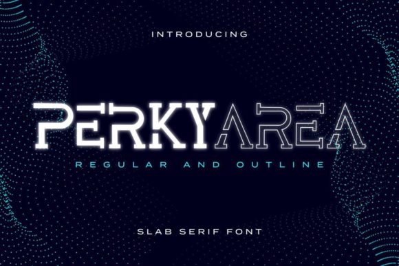
As a web designer who ships landing pages, SaaS dashboards, and boutique e-commerce sites, I treat typography like interface logic—not decoration. Every font choice affects how fast users scan, where they pause, and whether they trust what they’re seeing. That’s why Perky Area stands out in my toolkit: it’s a display font built for impact without sacrificing intentionality. Its rounded terminals, uneven baseline rhythm, and friendly x-height give it personality—yet it never feels chaotic or hard to parse at a glance.
Perky Area isn’t meant for paragraphs or navigation menus. It’s designed for moments that need emphasis: hero headlines, section dividers, CTA buttons, logo lockups, and branded banners. Think of it as the typographic equivalent of a confident handshake—immediate, warm, and memorable. On a coaching website’s hero section, pairing Perky Area with a clean sans serif like Inter or Open Sans creates instant contrast: one voice speaks brand energy, the other delivers clarity. That duality strengthens visual hierarchy and guides attention exactly where conversion goals demand it.
In responsive layouts, Perky Area performs best at larger sizes—24px and up on desktop, 20px+ on mobile—with generous letter spacing (0.5–1.2px) to preserve legibility on small screens. Avoid cramming it into tight button labels or footer links; instead, reserve it for short, high-value phrases like “Join the Movement,” “New Collection,” or “Your First Session Is Free.” When layered over images or dark backgrounds, use subtle text shadows (1px blur, rgba(0,0,0,0.3)) or solid background overlays to ensure contrast meets WCAG AA standards. Light-on-dark works beautifully—just test readability across iOS and Android browsers before launch.
For online stores, Perky Area shines in product banners and seasonal campaign headers. A handmade ceramics shop might use it for “Spring Glaze Drop” above a grid of mugs—its playful curves echo hand-thrown forms while keeping messaging crisp. On course sales pages, it adds approachability to value-driven headlines like “Learn UI Design in 6 Weeks”—softening the perceived effort of enrollment without undermining professionalism. Even in portfolio sites, Perky Area helps creative freelancers signal their aesthetic before a single project image loads: it tells visitors, “This is thoughtful, human-centered work—not templated output.”
Font pairing is where Perky Area reveals its real utility. As a display font, it pairs most effectively with neutral, highly legible typefaces: geometric sans serifs (like Poppins or Manrope) for modern digital products, or low-contrast serifs (such as Cormorant Garamond or Lora) for editorial blogs or premium brand kits. Avoid stacking it with other decorative fonts—no script + display combos, no double-handwritten layering. Simplicity here isn’t minimalism; it’s strategic restraint. Let Perky Area carry tone, and let your body font carry information.
Check file support before integrating. Perky Area typically includes WOFF2 for optimal web performance, basic Latin character sets, and often stylistic alternates—like a bolder ‘A’ or looped ‘g’—that add nuance to logo treatments or social media graphics. If your audience includes multilingual users, verify extended language coverage (e.g., Central European or Turkish glyphs), especially for SaaS tools targeting global markets. No webfont service? Self-host with proper CORS headers and preload critical display styles to avoid layout shifts.
Licensing matters—especially when shipping client sites or digital templates. Perky Area is a commercial font, meaning standard desktop licenses don’t cover live websites, Shopify themes, or Figma UI kits. Always opt for a web font license that covers your domain count, pageviews, or usage tier. For agencies, this means tracking deployments across client projects; for solopreneurs, it means choosing scalable plans that include embeds for landing pages, email headers, and banner assets. Skipping this step risks legal exposure—and undermines the very brand credibility you’re trying to build with thoughtful typography.
Where Perky Area truly earns its place is in tone alignment. It doesn’t scream “fun”—it whispers “friendly expertise.” That makes it ideal for wellness brands, creative education platforms, indie publishers, and service-based businesses that want warmth without whimsy. Unlike many playful display fonts, it avoids childish associations through balanced proportions and consistent stroke weight. There’s no exaggerated bounce or cartoonish exaggeration—just confident, grounded energy.
Use it for blog headers to reinforce author voice, not just decoration. Try it in testimonial highlights (“‘This changed how I design interfaces’ — Maya T., Product Lead”) to add subtle emphasis without disrupting reading flow. On app onboarding screens, deploy it for milestone titles (“You’re All Set!” or “Let’s Begin”)—short bursts that reward progress and feel human, not robotic. Even in dark mode interfaces, Perky Area retains its character when rendered in off-whites or soft teals, proving versatility beyond light-background defaults.
Ultimately, Perky Area supports digital identity by making brand voice visible—not just audible. It turns abstract values like “approachable,” “creative,” or “thoughtful” into something users feel in their first 3 seconds on the page. That’s not flair. It’s functional typography. And in a landscape crowded with generic sans serifs and overused system fonts, choosing a considered display font like Perky Area signals intentionality—not just in design, but in how you show up for your audience.